New Data for the New Year
Dec. 15, 2022
Samantha Breslin
2022 has been an exciting year of growth at the City Health Dashboard. Now over 900 cities have access to necessary data on health and its drivers, including many small and midsized communities. We’ve updated our geographies to reflect changes from the 2020 Census, improved the mapping experience for our users, and added new years of data for many of our metrics. And finally, through partnerships with other researchers, we’ve introduced 4 important and innovative measures to the Dashboard that make the site even more comprehensive and reflective of the growing challenges that cities across the U.S. are facing: credit insecurity, ozone pollution, firearm homicides, and firearm suicides.
We wanted to close out this year on a high note, and for us that means releasing more data and continuing to improve the user experience for everyone who visits the website. Read on to learn more about what we’ve updated this month.
Improving the User Experience: Updates to the Metric Detail Page
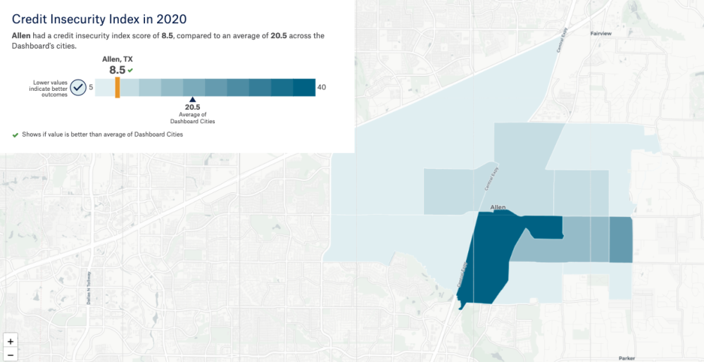
The metric detail page has an updated look! Based on user feedback, we’ve improved the ability to locate a specific neighborhood on the map and get more information about that neighborhood’s performance. Let’s walk through the updates together, using credit insecurity in Allen, TX. First, the scalebar is now overlaid on the map, to keep everything in a single view.

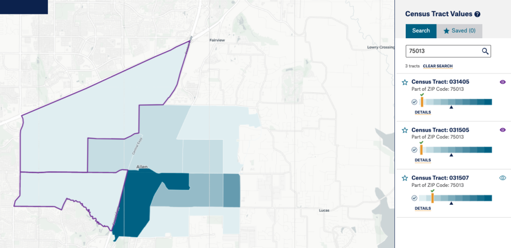
We’ve made the zip code search more prominently featured next to the map. Type in the zip code that you want to explore into the search bar and all of the neighborhoods that are part of that zip code will be pulled out to the side.
You now have the ability to highlight neighborhoods on the map from that list. Just click the eye icon on the top right of the scale bar to then see the tract highlighted in purple on the map. The neighborhood will continue to be highlighted even if you change metrics. To turn off the highlight, simply click the eye icon again. With this feature, you'll never lose sight of the neighborhoods you're focusing on.

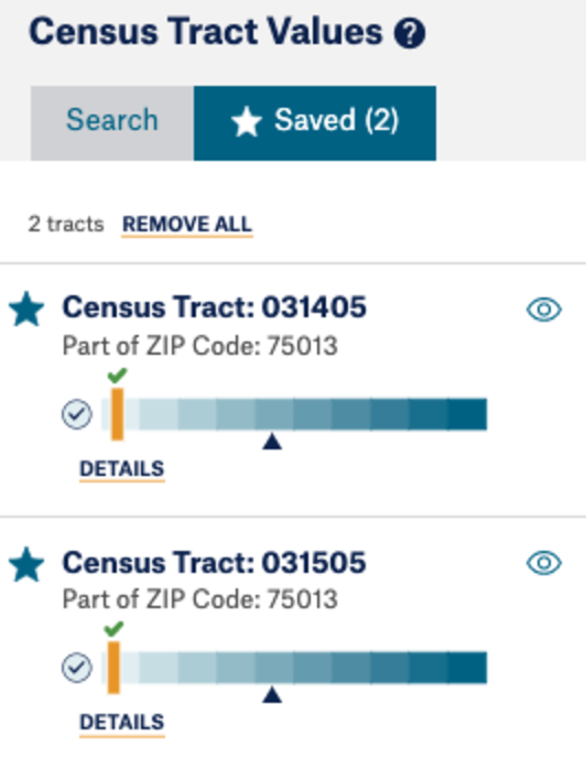
From that list of tracts, you’ll also notice a star icon on the top left of each tracts’ scale bar. This is the save feature and it’s activated by click. You can also save tracts from neighborhoods on the map. When you click on a neighborhood from the map, a tool tip will appear with that same star icon. All saved tracts are added to a list that is accessed from the “Saved” tab to the right of the map. Your list of saved tracts will be maintained if you change metrics or cities and even when you leave the site and come back (as long as you don’t clear your browsers cache or search history). This feature is particularly useful if you want to keep track of certain neighborhoods to see how they perform across metrics or time.
We hope these new features will make it easier and more intuitive to find what you need on the site. Join us for our January Virtual Office Hours where we’ll explore these features in more depth, and let us know if you have any questions about how to use them in your work.

Replacing and Retiring Measures
Replacing Excessive Housing Cost With Rent Burden
Since launching, the Dashboard has presented a measure of excessive housing cost which shows the percent of households spending more than 30% of their income on housing costs, including both renters and homeowners. However, after many conversations with users and experts in the field, we’ve decided to switch to a separate measure of rent burden. The COVID-19 pandemic has both highlighted and exacerbated a housing crisis that largely impacts renters with rising, often unattainable rent prices, forcing them to make impossible decisions between seeing a doctor or buying nutritious foods for their family and paying for rent. Starting this month, the Dashboard now presents Rent Burden (replacing Excessive Housing Cost) which measures the percent of renters spending more than 30% of their income on housing costs. This measure comes from the American Community Survey and is available at both the city and neighborhood level for all Dashboard cities.Learn more about Rent Burden and explore these new data for your city.
Removing Violent Crime
The Dashboard has presented a metric called “Violent Crime” on the website, which measured violent crime offenses (murder, aggravated assault, robbery, forcible rape) per 100,000 population in a city. However, the Dashboard team has become concerned that these data might misrepresent violent crime in cities, and could be used in ways that contribute to or perpetuate structural racism.Earlier this year, we added Firearm Homicides to the Dashboard, which is a more specific metric of violent crime, based on accurate, reliable data. This is why, after much research and consideration, we have removed the Violent Crime metric from the website. We welcome user feedback on this change, so please email us.
New Months of Data
Users frequently ask us for more current data. This is especially true now, when fast-paced COVID-19 metrics have raised our expectations for speedy public health data. Our team is committed to exploring new metrics and more timely data sources, including our two monthly measures, both of which are now updated to the most recent month available.
Air pollution – ozone ( now through December 2021)
Unemployment: current city-level (now through September 2022)
With these data, users can see more precisely how these measures vary over time in cities, essential context for policies and programs aimed at addressing these issues.